
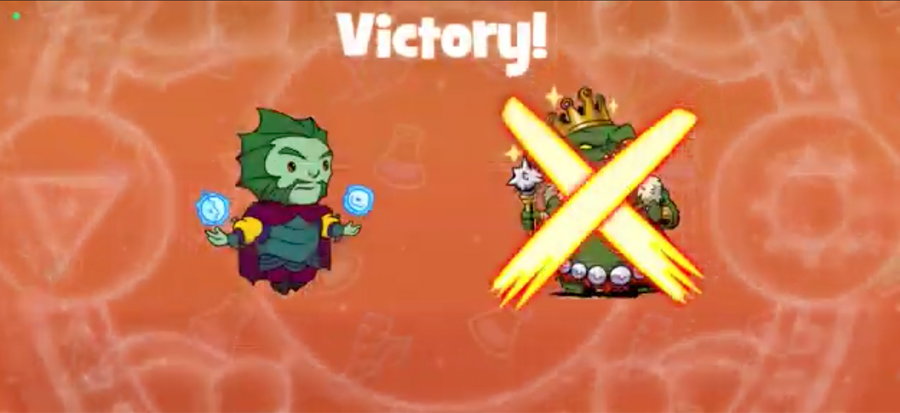
This is the original layout.
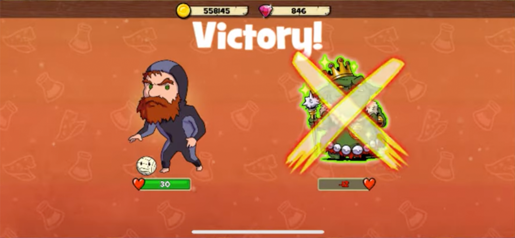
Instead of altering the animations too much, they were repurposed with the original content. Health meters were also added to this screen to be informative to the Player.
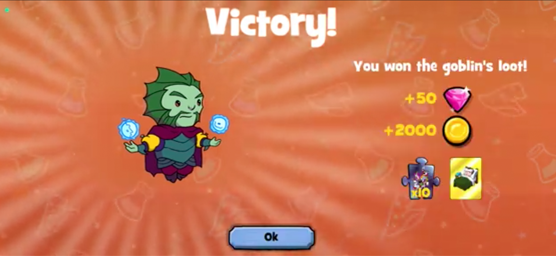
The original summary screen not always captured what was won in one view. This made it difficult to just add a tap thru in order to speed up the animation.
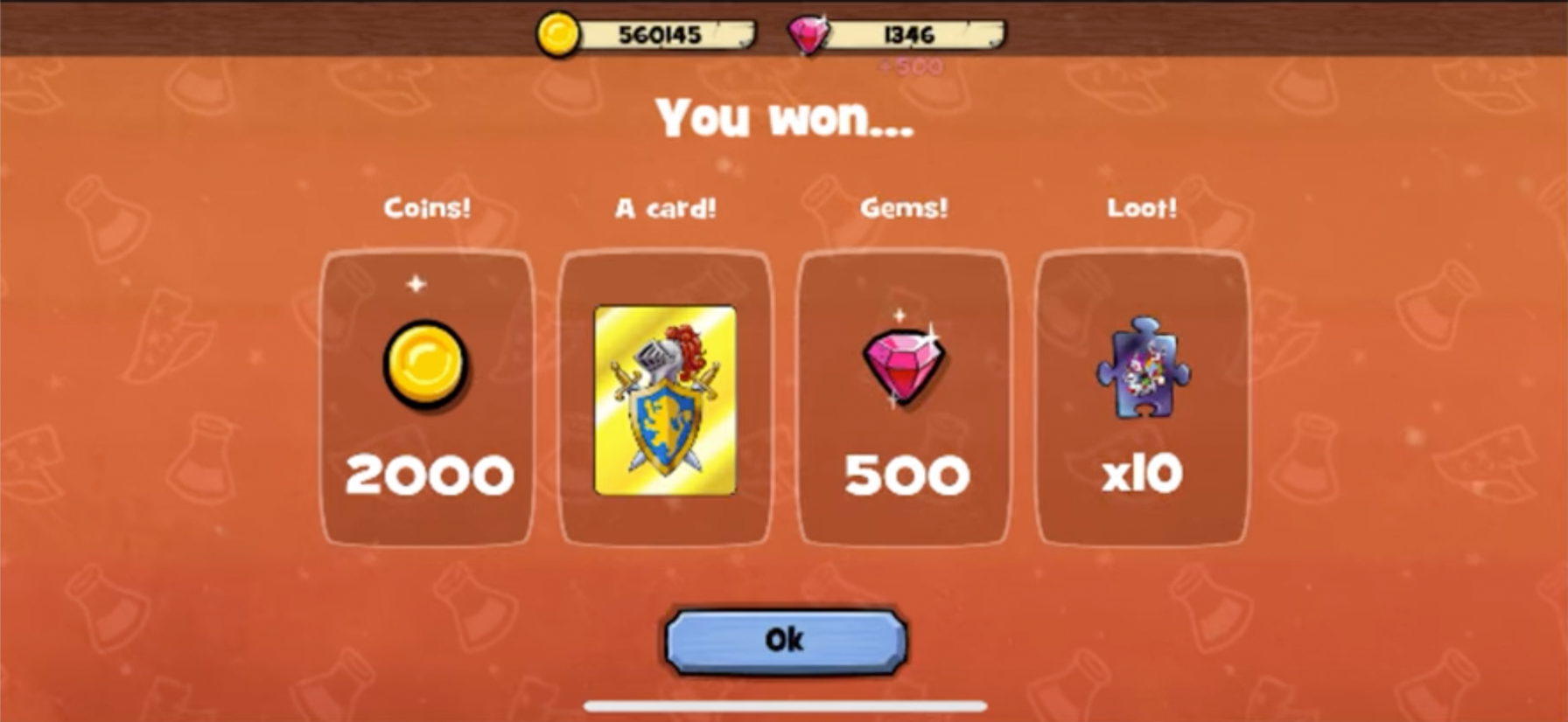
In the revised design, the space was better utilized and all items won animated in and settled on the summary screen. If a Player tapped thru the animations, they would get this screen right away. This was ideal, to give the Player some autonomy on pacing and also limit them from skipping over what they won and be confused they didn't receive it.
Player feedback!